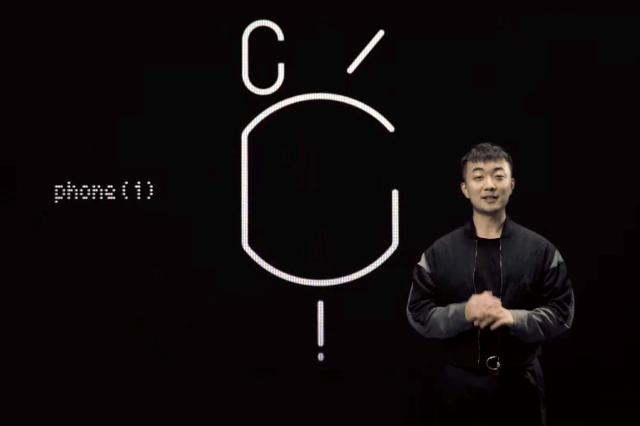
Like most people, I too was baffled to see that strange white-on-black pictogram when Carl teased the Nothing phone (1). Surely it meant something. Or did it mean ‘nothing’? Well, knowing the company’s ability and need to keep the hype train constantly moving, I’m sure that strange line-art wasn’t just randomly generated. Here are a few thoughts that immediately sprung to mind.
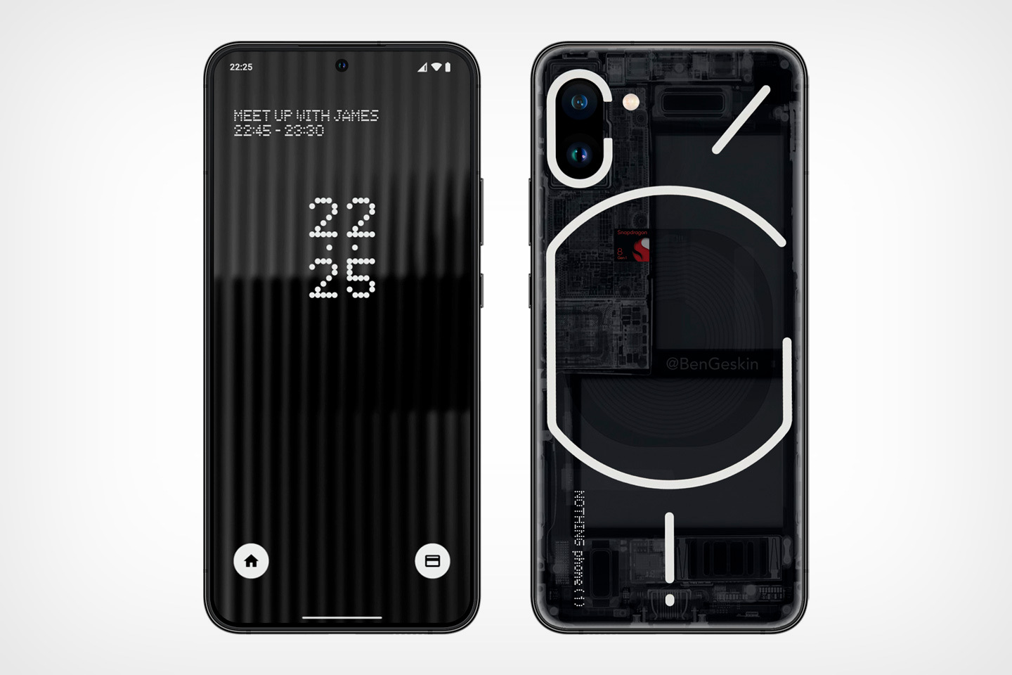
The most widely circulated interpretation of the symbol came from concept-designer Ben Geskin. Geskin’s design turned the C in the top left corner into a camera bump, and let the rest of the symbols naturally fall in line. This sort of opened up a few possibilities – firstly, of a wireless charging coil on the back (that’s what that main shape seems to be), although, along with the vertical line below that, it sort of looks like Apple’s MagSafe connector. Here’s what they look like side by side.
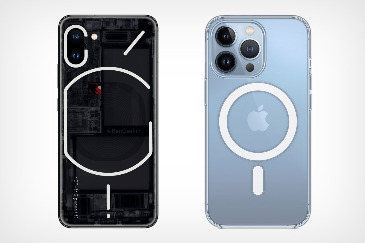
While I’m pretty sure Nothing can’t use the words MagSafe to announce such a feature (it would violate Apple’s trademarks), Carl did mention the fact that the phone was built to work seamlessly with products from other companies. Could the Nothing phone (1) have a magnetic connector on the back? Well, just the realist in me says that it’s highly unlikely, although the idea of having a wireless charging coil on the back that’s visible through a transparent facade sounds much more plausible.
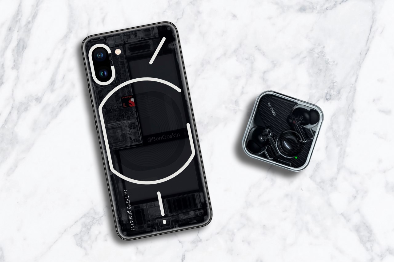
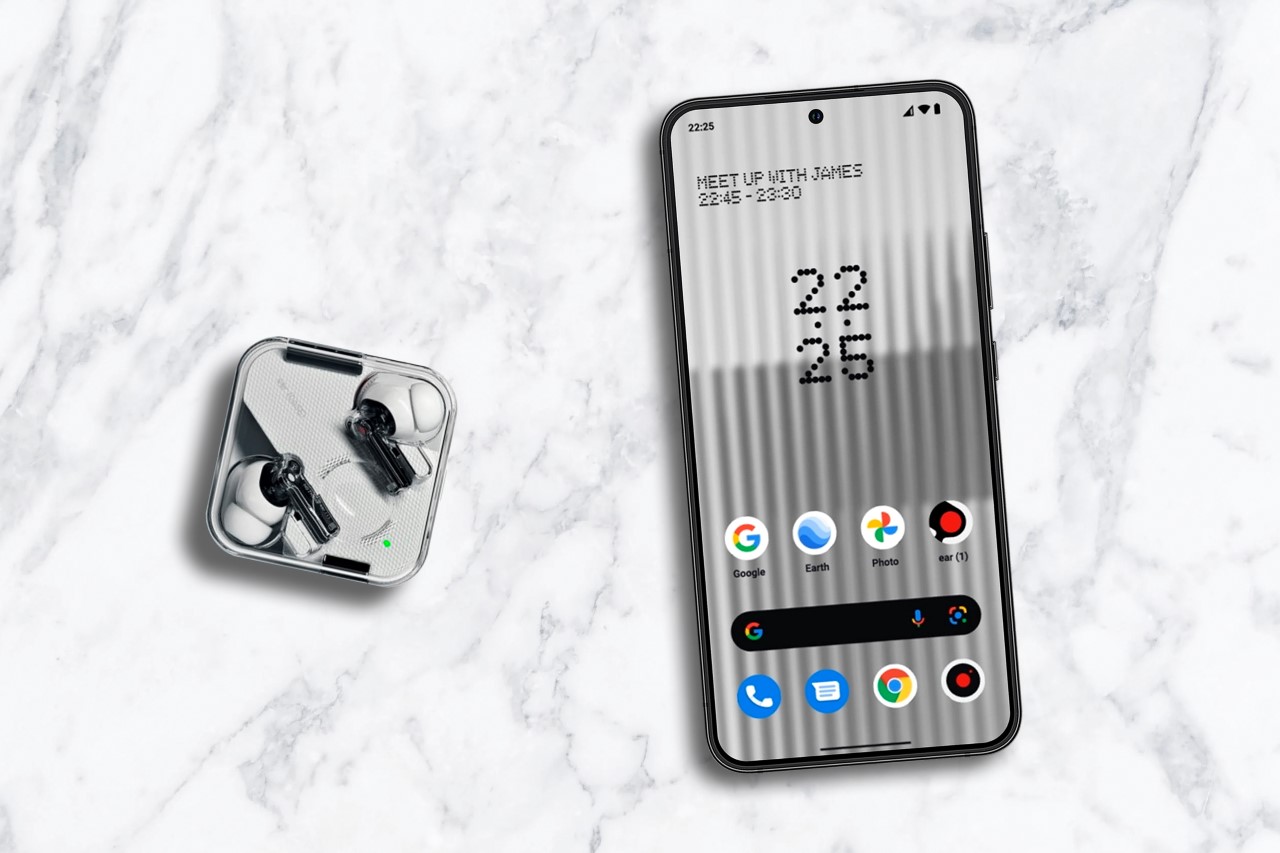
Here’s a look at a render of the Nothing phone (1) concept kept right beside the Nothing ear (1). I have to admit that they do look like a part of the same product family!
What about those lines, though? Well, your guess is as good as mine, although the diagonal line on the top right, along with the letter C feels a lot like the prefix in Command Prompt. I’m clearly reading tea leaves at this point, but Pei did allude to the fact that the Nothing OS was going to be lightweight, powerful, flexible, and in black-and-white. Sounds an awful lot like Command Prompt to me from under my tin foil hat, but I’m obviously going off the deep end. At the same time, the vertical dot and dash at the bottom sort of looks like power and volume keys, don’t they?
Enough of weird speculation about the back; let’s move to the front of the device. While Geskin’s concept shows a hole-punch camera in the center, a fleeting glimpse of the Nothing OS preview made me think otherwise. Pei did mention that the clock and battery indicator would permanently sit on the top left and right corners, making it pretty clear that the Nothing phone (1) would either have a hole punch camera or a notch camera… or was he hinting at something different? When the Nothing OS preview shows the camera app opening, there’s a downward-facing arrow right where the hole punch camera would sit (refer to the image below). This leads me to believe that Nothing actually has something better in store as far as the front-facing camera goes, because why else would a digital element be in the UI if there was, in fact, a hole punch camera at that location?
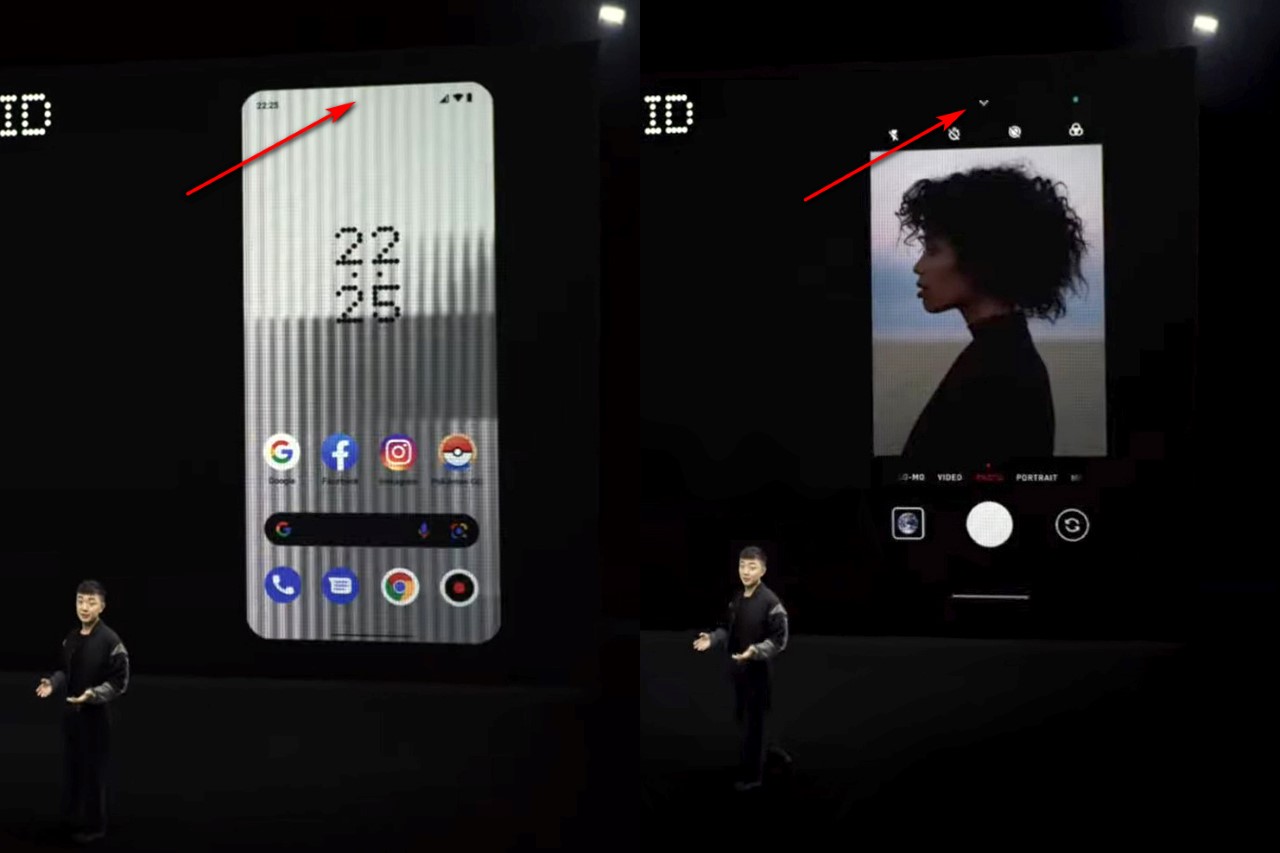
The only thing we can conclusively say about the Nothing phone (1) is that it’s coming in summer and it’ll run Nothing OS. Maybe looking at the Android launcher (which debuts next month) will give us a clearer picture of what to expect. That being said, it’s fun to imagine what the phone can look like, and what it’s capable of. Even if we’re completely wrong in our predictions, Carl definitely got one thing right. He got us hyped about tech again…
The post What was that cryptic logo during Carl Pei’s Nothing phone (1) announcement? Here are our thoughts. first appeared on Yanko Design.
No comments:
Post a Comment