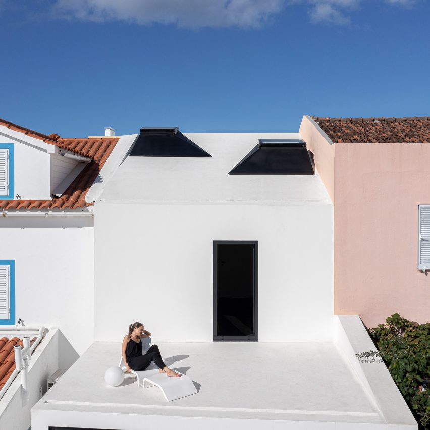
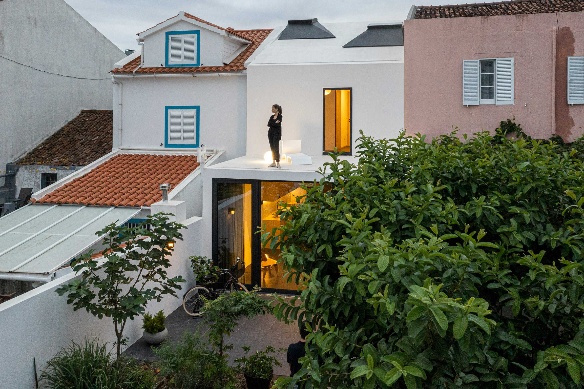
Portuguese practice Box Arquitectos has completed a narrow, white home in the dense urban centre of Ponta Delgado, with two volumes that face each other across a long garden.
With a site just over four metres wide, the local firm designed Windmill House to require minimal "transitioning spaces" such as corridors.
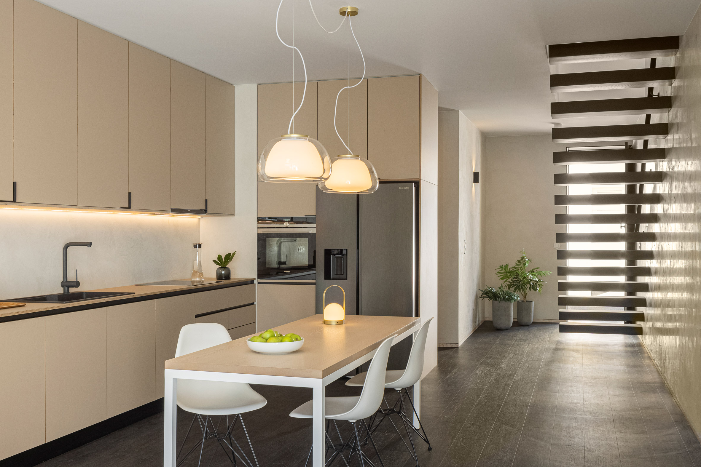
The entire ground floor is given over to a large social space and kitchen that opens onto a central garden.
"The program develops without the need of transitioning or dividing spaces," said Box Arquitectos. "The only social space of the house gains dimension in its depth when it finds the garden at the end of the space."
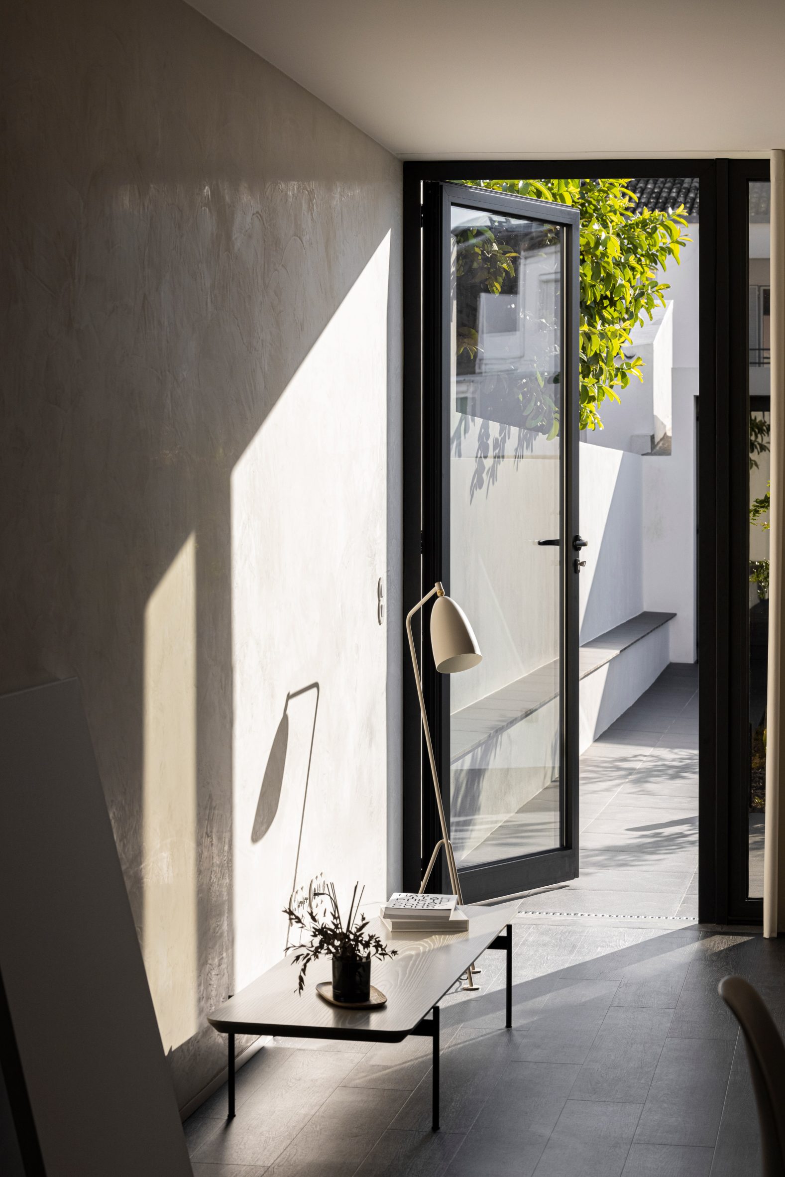
The garden is lined with white walls on either side and a built-in bench along one. Internal social spaces spill out onto a paved patio that surrounds a planted bed.
At the opposite end of the garden is an independent single-storey block housing an additional en-suite bedroom.
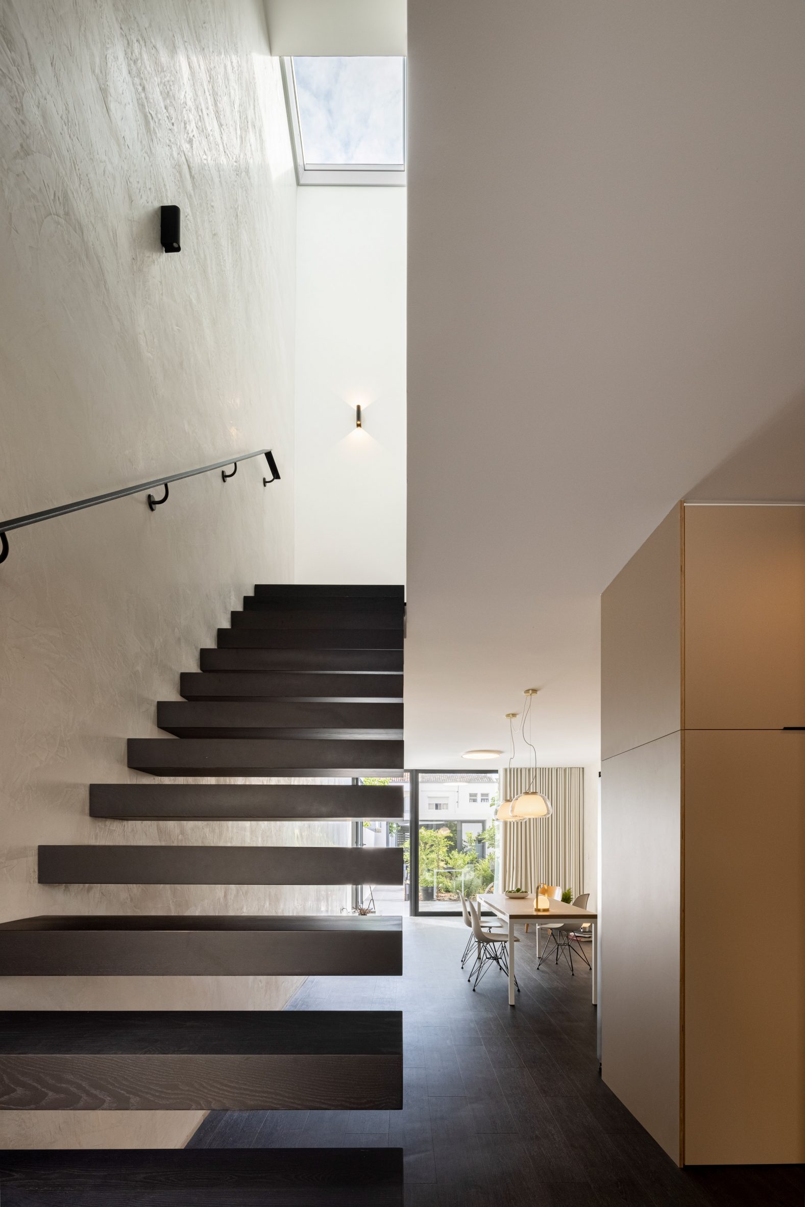
In the main home, a black floating-tread staircase leads up to the first floor, where small landing connects a bathroom and two bedrooms, one of which opens onto a terrace overlooking the garden.
What the practice describes as the "vertical perspective" of the home has been emphasised in the first-floor spaces through steeply sloping ceilings topped with skylights.
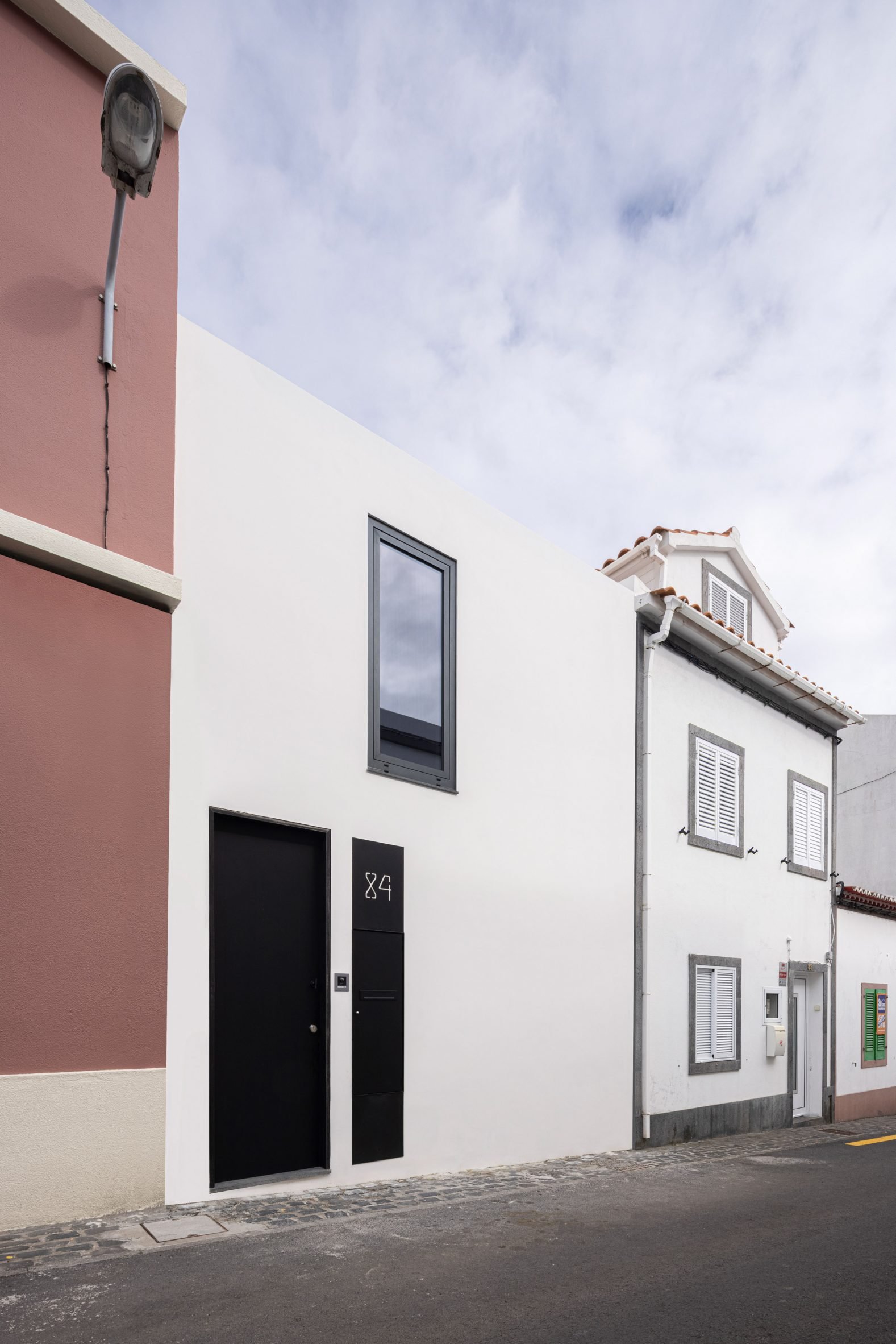
Two skylights illuminate the eastern bedroom and bathroom, while west-facing second bedroom looks out onto the street through the only window in the building's front facade.
"The necessity to simulate a greater spatial amplitude is made possible by the skylights in the pitched roof, which receives the light and spreads it throughout the interior spaces, working as a 'diaphragm', increasing the 'vertical perspective'," the practice said.
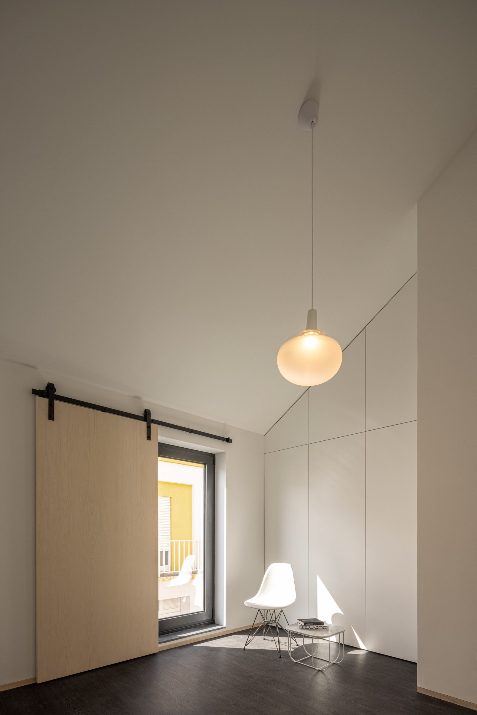
Finishes throughout the interior have been kept pale to increase the feeling of light in the home, including plastered walls, and pale wooden doors and kitchen cabinets.
Externally, the crisp white form mirrors the characteristic shape of the neighbouring buildings but with few external features.
This creates what the practice describes as "the child's imaginary drawing of a house – one door and one window".
"The main facade is exclusively the boundary between interior and exterior, with no reason for a relation between both, besides being in its way," it continued.
Given the cost of space in cities, many architects are designing homes that can squeeze into narrow plots and infill sites – 12 of which feature in Dezeen's round-up of house under four metres wide.
Architecture studio Anna and Eugeni Bach also built a residential building on an infill site in Barcelona that features vibrant balconies and an adaptable layout.
The photography is by Ivo Tavares Studio.
The post Box Arquitectos tucks Windmill House into skinny site in Portugal appeared first on Dezeen.
No comments:
Post a Comment