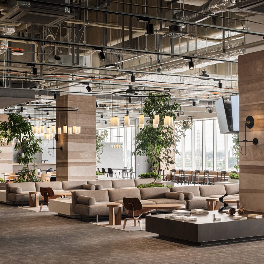
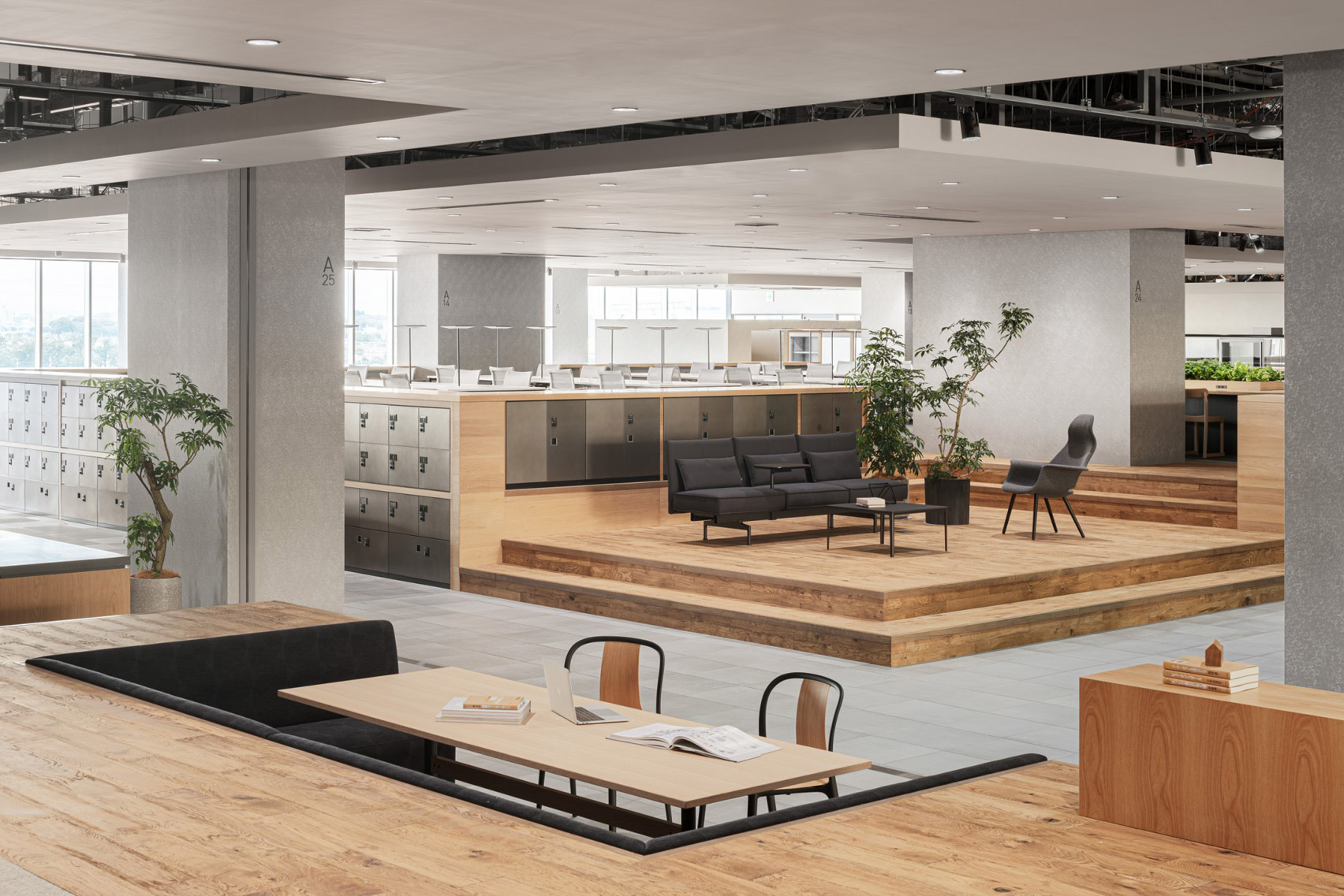
Design studio Flooat has used elevated work areas, structural columns and chunky plinths to simulate natural topography inside the offices of book publisher Kadokawa in Japan.
The 9,000-square-metre workspace, dubbed Kadokawa Tokorozawa Campus, is situated just north of Tokyo in the city of Tokorozawa.
Local studio Flooat was tasked with designing its spacious interior and decided against erecting walls or partitions to organise the floor plan.
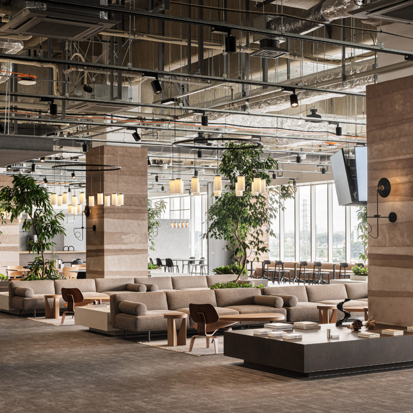
Instead, the team set out to create a "fluctuating landscape" of different seating areas that would suit the different work styles of staff employed across Kadokawa's various departments.
"The publishing giant is well established in a wide range of products from literary works to comics," said Flooat.
"But it has recently expanded into film, animation and video games. We designed the office to help employees follow their individual sensibilities within a collective of creative talent."
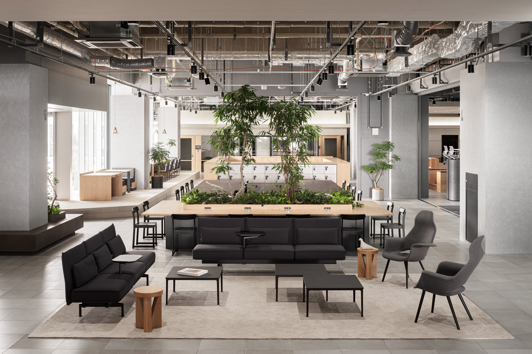
At the heart of the office is a lofty lounge area dressed with sofas and relaxed wide-back armchairs. Here, the staff is encouraged to hang out and chat throughout the day or host casual catch-ups with colleagues.
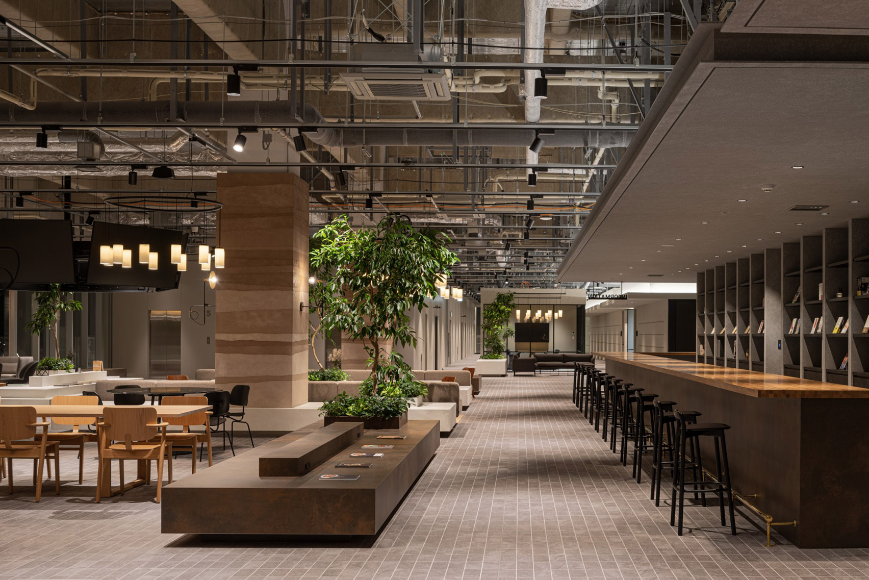
There is also what Flooat refer to as a "book bar", with a long counter where visitors can sit and flick through the publisher's latest releases, which are displayed on a tall gridded shelf in front.
Towards the outer edge of the office, a series of platforms are topped with formal desks. Set away from the hustle and bustle of the lounge, these raised areas provide a space for employees to do solo work without distractions.
Dropped ceilings have been constructed above each platform to foster a more enclosed, intimate feel.
A series of chunky display plinths have been dotted across the room to further enhance the "landscape" of the office. Some of these double up as bench seats, while others act as foliage-filled planters.
Flooat's topographical concept has also been applied to the interior's material and colour scheme, which has been curated to incorporate elements of nature.
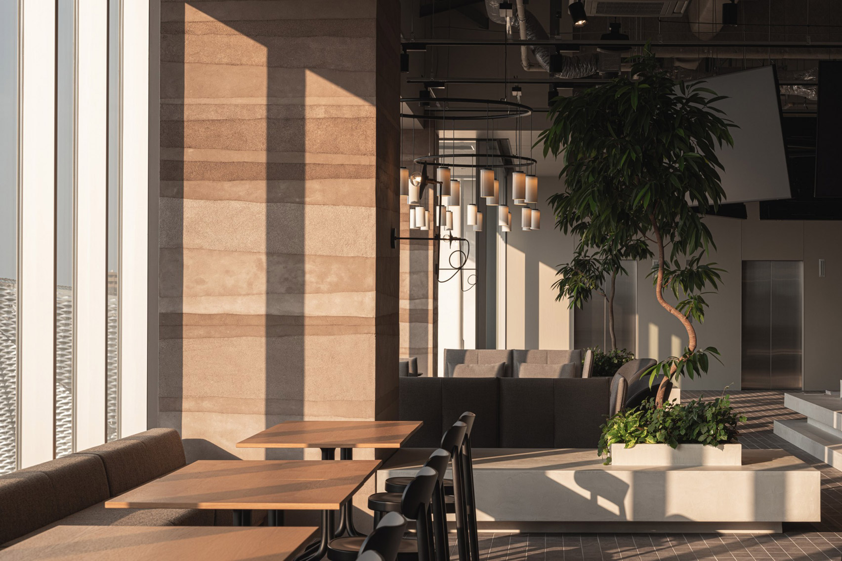
The exterior of some of the office's structural columns, for example, has been rendered to resemble layers of earth, while the surrounding surfaces are finished in wood or a traditional Japanese plaster made of earth, lime, sand and plant fibres.
"I wanted to use traditional Japanese techniques in a modern office space," explained Flooat designer Yumika Yoshida.
"This material also creates beautiful shadows, so people who work here can feel the changes in the space as time passes throughout the day."
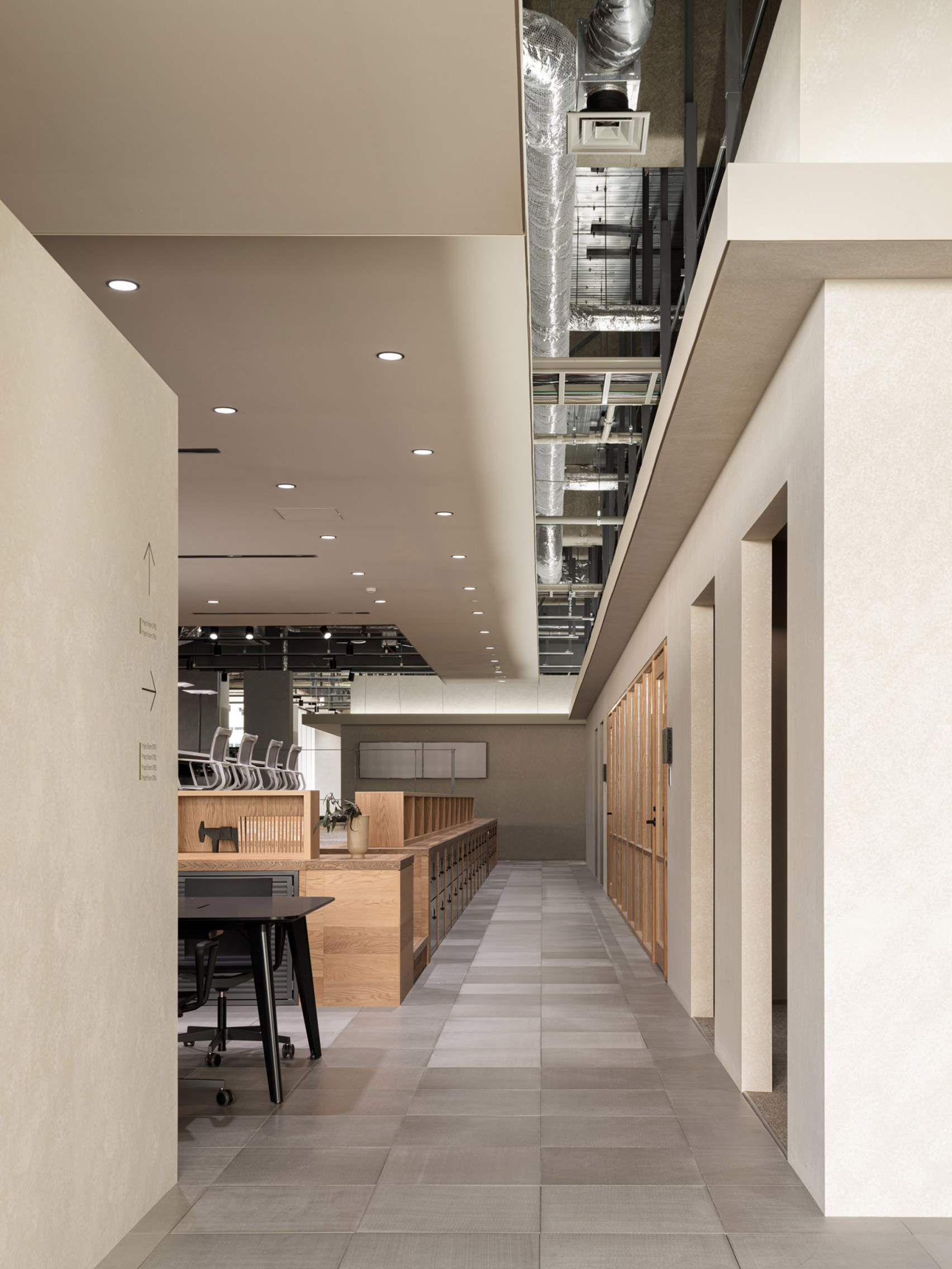
"I chose materials that are not homogeneous and give a sense of nature," she continued. "I wanted to create a space that would not give the cold impression of artificial materials."
This feeling is amplified through an abundance of potted plants and an outdoor terrace that floods the interior with natural light.
Flooat's Kadokawa Tokorozawa Campus is shortlisted in the large workspace interior category of this year's Dezeen Awards.
Other projects in the running include Education First's office in Denver, which is designed to reference the city's outdoorsy culture, and the YTL headquarters in Kuala Lumpur with their luxe mixture of marble and bronze surfaces.
Photography is by Tomooki Kengaku.
Project credits:
Design: Flooat, Okamura Corporation
Design planning: Suppose Design Office
The post Flooat creates "fluctuating landscape" inside publishing office near Tokyo appeared first on Dezeen.
No comments:
Post a Comment